Visualization x Data Accessibility
Data is everywhere, but not always accessible to everyone. Visualization aims to improve access, yet often assumes a one-size-fits-all user with standard cognitive skills, excluding many. Originating from a collaboration in 2018 with the State of the States in IDD, we work with individuals with intellectual and developmental disabilities—such as Down syndrome, autism, and cerebral palsy—to design more inclusive visualizations. Grounded in their lived experiences, our work helped establish the subfield of Cognitively Accessible Visualization, and continues to reimagine how data can be made cognitively inclusive, meaningful, and just for all.
Our Stories, Our Data: Co-Designing Visualizations with People with Intellectual and Developmental Disabilities ACM ASSETS 2024
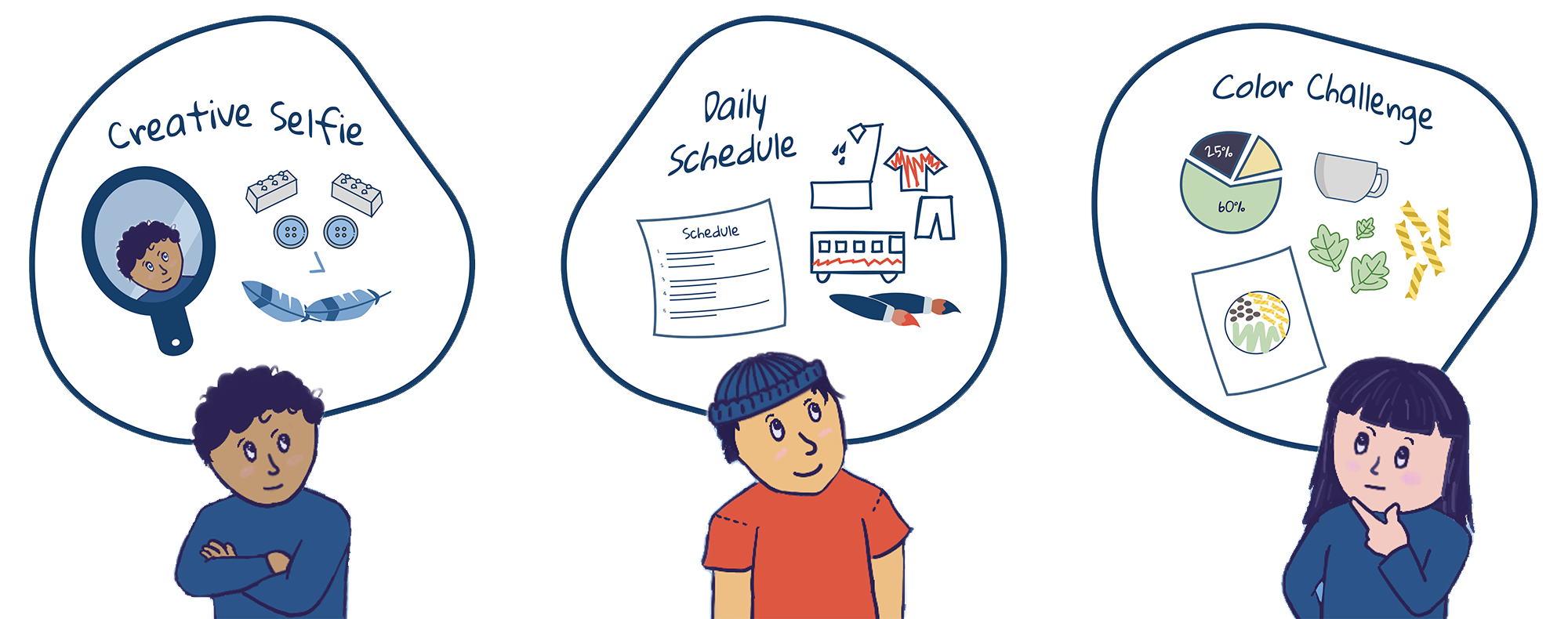
How do individuals with IDD represent data? What can we learn to design cognitively accessible visualizations? In this study, we invited 20 individuals with IDD as co-designers to reimagine how visualizations could look and feel. The findings point to a paradigm shift, emphasizing the importance of narrative, embodied, and affective approaches to data accessibility.
🔗 Read the Paper
Data Data Everywhere: Uncovering Everyday Data Experiences for People with Intellectual and Developmental Disabilities ACM CHI 2023
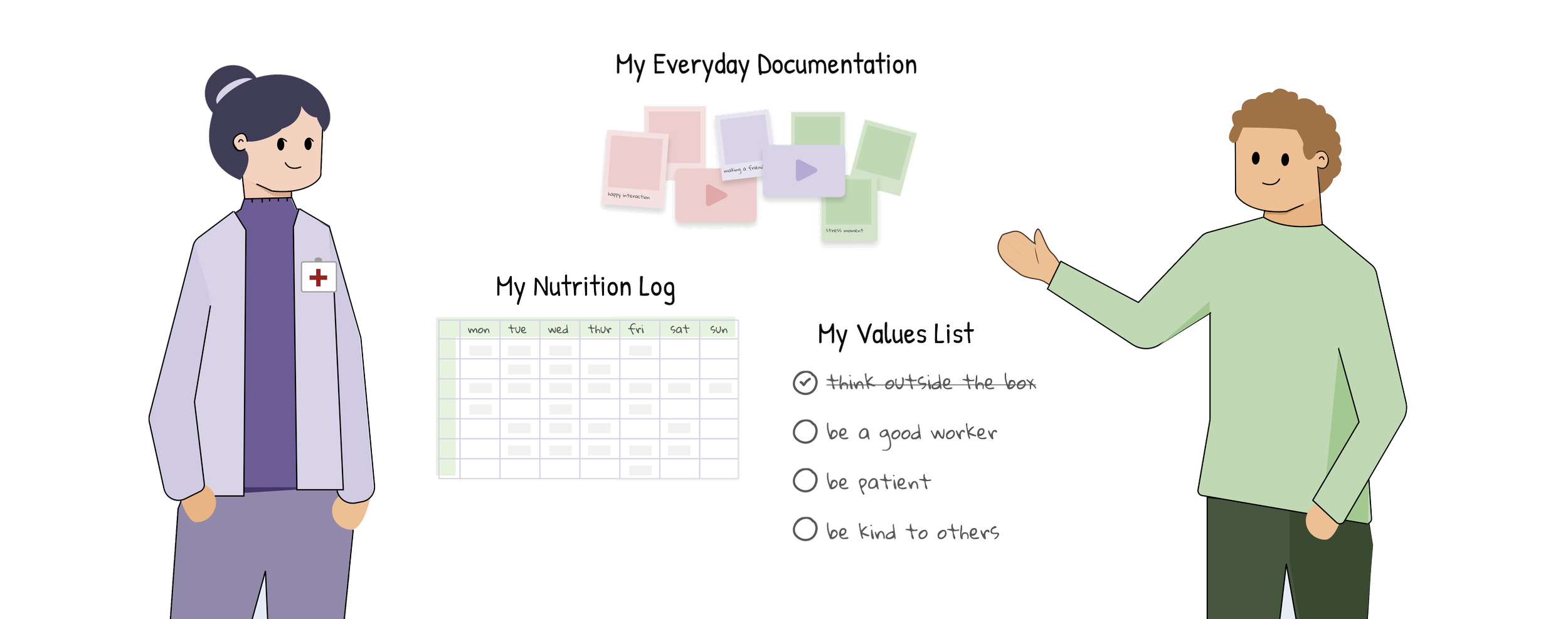
Data plays a vital role in everyday life, but how do people with IDD engage with it? In this study, we interviewed 15 individuals from the IDD community to understand their experiences with data and their needs from visualizations. The result is a critical near-term research agenda for cognitively accessible visualization design. We reimagined the role of visualization not just as a tool for understanding data, but as a means of supporting self-advocacy, therapeutic expression, and autonomy.
Understanding Data Accessibility for People with Intellectual and Developmental Disabilities ACM CHI 2021
🏆 Best Paper Award
Conventional visualizations often assume users have standardized cognitive abilities, such as abstract thinking, spatial reasoning, and information synthesis. These abilities, however, often operate differently for individuals with intellectual and developmental disabilities (IDD), including those with Down syndrome, autism, and cerebral palsy. As a result, this population has been largely excluded from data-driven conversations.
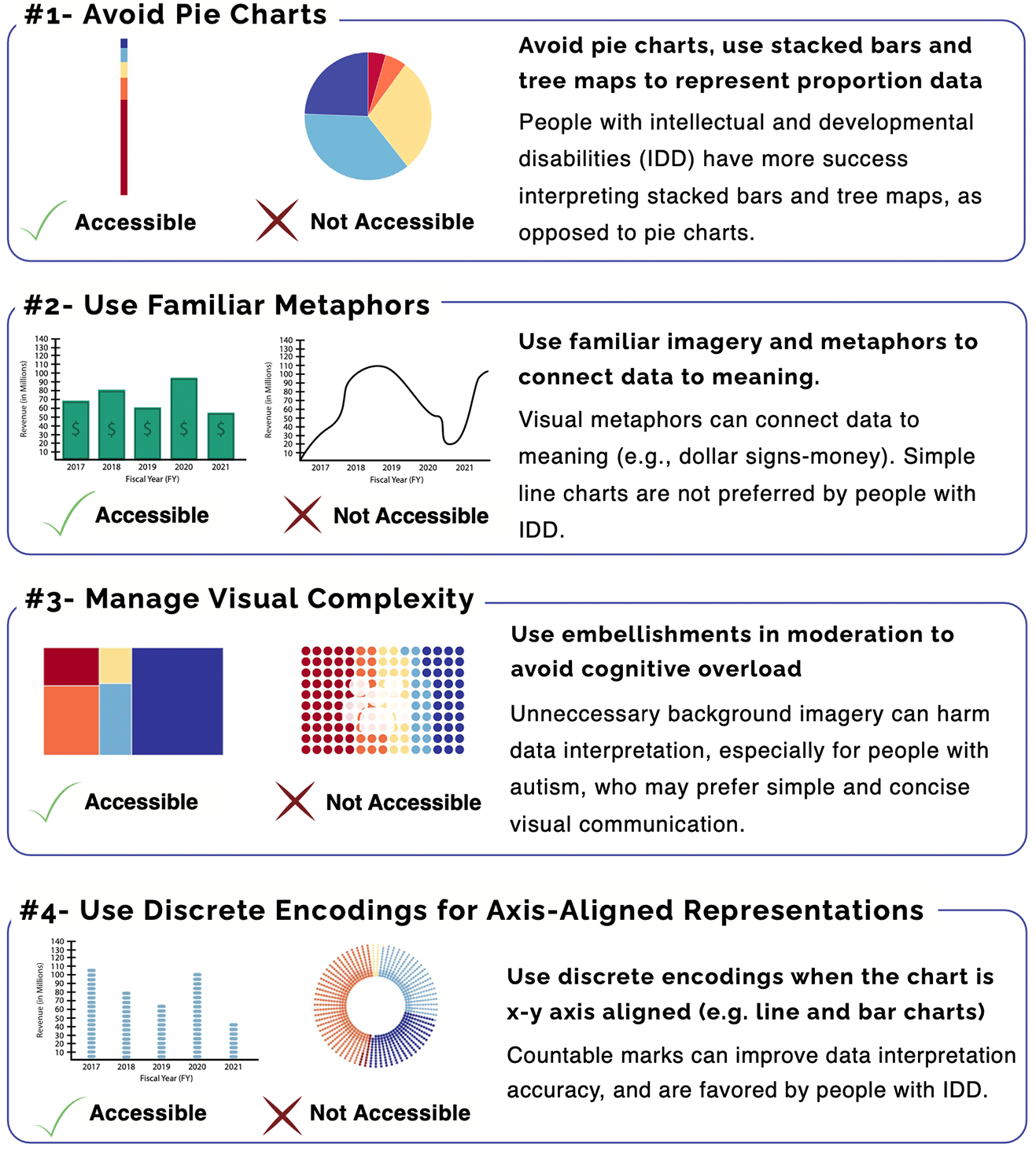
We conducted a web-based mixed-methods study examining three visualization design variables in the context of financial self-advocacy, and proposed four preliminary guidelines for more cognitively accessible visualizations. Our findings suggest that conventional designs can introduce inherent cognitive barriers, highlighting the need for more inclusive design practices.
🔗 Read the Paper
🎙️ Watch the Talk